9 Judging Model Effectiveness
Once we have a model, we need to know how well it works. A quantitative approach for estimating effectiveness allows us to understand the model, to compare different models, or to tweak the model to improve performance. Our focus in tidymodels is on empirical validation; this usually means using data that were not used to create the model as the substrate to measure effectiveness.
The best approach to empirical validation involves using resampling methods that will be introduced in Chapter 10. In this chapter, we will motivate the need for empirical validation by using the test set. Keep in mind that the test set can only be used once, as explained in Section 5.1.
When judging model effectiveness, your decision about which metrics to examine can be critical. In later chapters, certain model parameters will be empirically optimized and a primary performance metric will be used to choose the best sub-model. Choosing the wrong metric can easily result in unintended consequences. For example, two common metrics for regression models are the root mean squared error (RMSE) and the coefficient of determination (a.k.a. \(R^2\)). The former measures accuracy while the latter measures correlation. These are not necessarily the same thing. Figure 9.1 demonstrates the difference between the two.
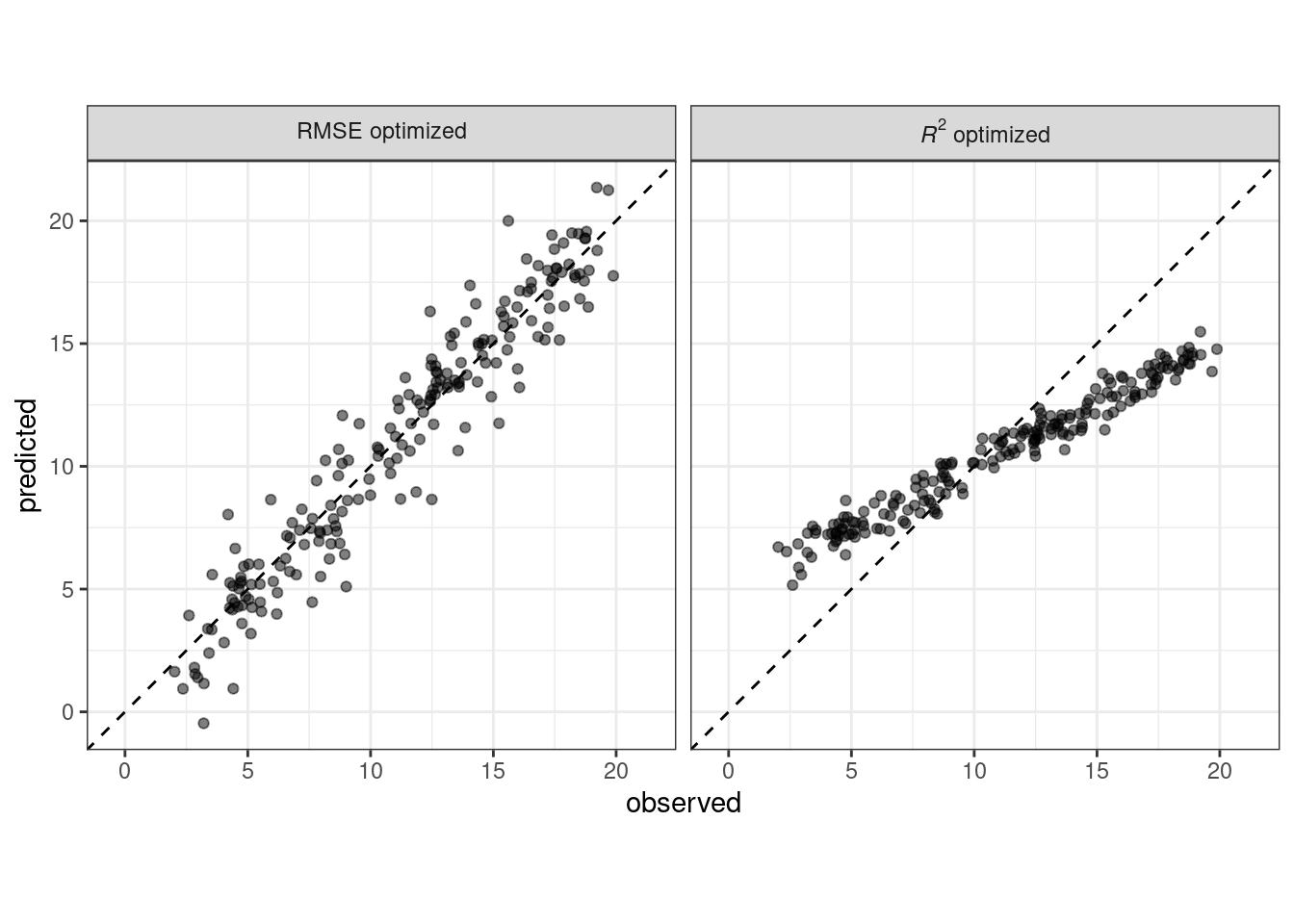
Figure 9.1: Observed versus predicted values for models that are optimized using the RMSE compared to the coefficient of determination
A model optimized for RMSE has more variability but has relatively uniform accuracy across the range of the outcome. The right panel shows that there is a tighter correlation between the observed and predicted values but this model performs poorly in the tails.
This chapter will demonstrate the yardstick package, a core tidymodels packages with the focus of measuring model performance. Before illustrating syntax, let’s explore whether empirical validation using performance metrics is worthwhile when a model is focused on inference rather than prediction.
9.1 Performance Metrics and Inference
The effectiveness of any given model depends on how the model will be used. An inferential model is used primarily to understand relationships, and typically emphasizes the choice (and validity) of probabilistic distributions and other generative qualities that define the model. For a model used primarily for prediction, by contrast, predictive strength is of primary importance and other concerns about underlying statistical qualities may be less important. Predictive strength is usually determined by how close our predictions come to the observed data, i.e., fidelity of the model predictions to the actual results. This chapter focuses on functions that can be used to measure predictive strength. However, our advice for those developing inferential models is to use these techniques even when the model will not be used with the primary goal of prediction.
A longstanding issue with the practice of inferential statistics is that, with a focus purely on inference, it is difficult to assess the credibility of a model. For example, consider the Alzheimer’s disease data from Craig–Schapiro et al. (2011) when 333 patients were studied to determine the factors that influence cognitive impairment. An analysis might take the known risk factors and build a logistic regression model where the outcome is binary (impaired/non-impaired). Let’s consider predictors for age, sex, and the Apolipoprotein E genotype. The latter is a categorical variable with the six possible combinations of the three main variants of this gene. Apolipoprotein E is known to have an association with dementia (Jungsu, Basak, and Holtzman 2009).
A superficial, but not uncommon, approach to this analysis would be to fit a large model with main effects and interactions, then use statistical tests to find the minimal set of model terms that are statistically significant at some pre-defined level. If a full model with the three factors and their two- and three-way interactions were used, an initial phase would be to test the interactions using sequential likelihood ratio tests (Hosmer and Lemeshow 2000). Let’s step through this kind of approach for the example Alzheimer’s disease data:
When comparing the model with all two-way interactions to one with the additional three-way interaction, the likelihood ratio tests produces a p-value of 0.888. This implies that there is no evidence that the four additional model terms associated with the three-way interaction explain enough of the variation in the data to keep them in the model.
Next, the two-way interactions are similarly evaluated against the model with no interactions. The p-value here is 0.0382. This is somewhat borderline, but, given the small sample size, it would be prudent to conclude that there is evidence that some of the 10 possible two-way interactions are important to the model.
From here, we would build some explanation of the results. The interactions would be particularly important to discuss since they may spark interesting physiological or neurological hypotheses to be explored further.
While shallow, this analysis strategy is common in practice as well as in the literature. This is especially true if the practitioner has limited formal training in data analysis.
One missing piece of information in this approach is how closely this model fits the actual data. Using resampling methods, discussed in Chapter 10, we can estimate the accuracy of this model to be about 73.4%. Accuracy is often a poor measure of model performance; we use it here because it is commonly understood. If the model has 73.4% fidelity to the data, should we trust conclusions it produces? We might think so until we realize that the baseline rate of nonimpaired patients in the data is 72.7%. This means that, despite our statistical analysis, the two-factor model appears to be only 0.8% better than a simple heuristic that always predicts patients to be unimpaired, regardless of the observed data.
The point of this analysis is to demonstrate the idea that optimization of statistical characteristics of the model does not imply that the model fits the data well. Even for purely inferential models, some measure of fidelity to the data should accompany the inferential results. Using this, the consumers of the analyses can calibrate their expectations of the results.
In the remainder of this chapter, we will discuss general approaches for evaluating models via empirical validation. These approaches are grouped by the nature of the outcome data: purely numeric, binary classes, and three or more class levels.
9.2 Regression Metrics
Recall from Section 6.3 that tidymodels prediction functions produce tibbles with columns for the predicted values. These columns have consistent names, and the functions in the yardstick package that produce performance metrics have consistent interfaces. The functions are data frame-based, as opposed to vector-based, with the general syntax of:
function(data, truth, ...)where data is a data frame or tibble and truth is the column with the observed outcome values. The ellipses or other arguments are used to specify the column(s) containing the predictions.
To illustrate, let’s take the model from Section 8.8. This model lm_wflow_fit combines a linear regression model with a predictor set supplemented with an interaction and spline functions for longitude and latitude. It was created from a training set (named ames_train). Although we do not advise using the test set at this juncture of the modeling process, it will be used here to illustrate functionality and syntax. The data frame ames_test consists of 588 properties. To start, let’s produce predictions:
ames_test_res <- predict(lm_fit, new_data = ames_test %>% select(-Sale_Price))
ames_test_res
#> # A tibble: 588 × 1
#>   .pred
#>   <dbl>
#> 1  5.07
#> 2  5.31
#> 3  5.28
#> 4  5.33
#> 5  5.30
#> 6  5.24
#> # ℹ 582 more rows
The predicted numeric outcome from the regression model is named .pred. Let’s match the predicted values with their corresponding observed outcome values:
ames_test_res <- bind_cols(ames_test_res, ames_test %>% select(Sale_Price))
ames_test_res
#> # A tibble: 588 × 2
#>   .pred Sale_Price
#>   <dbl>      <dbl>
#> 1  5.07       5.02
#> 2  5.31       5.39
#> 3  5.28       5.28
#> 4  5.33       5.28
#> 5  5.30       5.28
#> 6  5.24       5.26
#> # ℹ 582 more rows
We see that these values mostly look close, but we don’t yet have a quantitative understanding of how the model is doing because we haven’t computed any performance metrics. Note that both the predicted and observed outcomes are in log-10 units. It is best practice to analyze the predictions on the transformed scale (if one were used) even if the predictions are reported using the original units.
Let’s plot the data in Figure 9.2 before computing metrics:
ggplot(ames_test_res, aes(x = Sale_Price, y = .pred)) +
  # Create a diagonal line:
  geom_abline(lty = 2) +
  geom_point(alpha = 0.5) +
  labs(y = "Predicted Sale Price (log10)", x = "Sale Price (log10)") +
  # Scale and size the x- and y-axis uniformly:
  coord_obs_pred()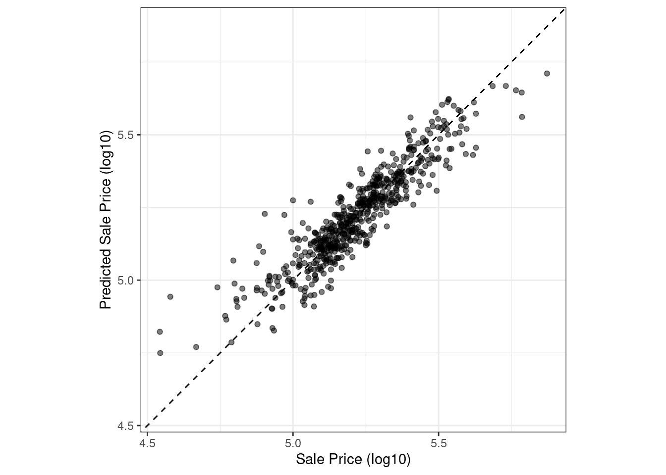
Figure 9.2: Observed versus predicted values for an Ames regression model, with log-10 units on both axes
There is one low-price property that is substantially over-predicted, i.e., quite high above the dashed line.
Let’s compute the root mean squared error for this model using the rmse() function:
rmse(ames_test_res, truth = Sale_Price, estimate = .pred)
#> # A tibble: 1 × 3
#>   .metric .estimator .estimate
#>   <chr>   <chr>          <dbl>
#> 1 rmse    standard      0.0736
This shows us the standard format of the output of yardstick functions. Metrics for numeric outcomes usually have a value of “standard” for the .estimator column. Examples with different values for this column are shown in the next sections.
To compute multiple metrics at once, we can create a metric set. Let’s add \(R^2\) and the mean absolute error:
ames_metrics <- metric_set(rmse, rsq, mae)
ames_metrics(ames_test_res, truth = Sale_Price, estimate = .pred)
#> # A tibble: 3 × 3
#>   .metric .estimator .estimate
#>   <chr>   <chr>          <dbl>
#> 1 rmse    standard      0.0736
#> 2 rsq     standard      0.836
#> 3 mae     standard      0.0549
This tidy data format stacks the metrics vertically. The root mean squared error and mean absolute error metrics are both on the scale of the outcome (so log10(Sale_Price) for our example) and measure the difference between the predicted and observed values. The value for \(R^2\) measures the squared correlation between the predicted and observed values, so values closer to one are better.
The yardstick package does not contain a function for adjusted \(R^2\). This modification of the coefficient of determination is commonly used when the same data used to fit the model are used to evaluate the model. This metric is not fully supported in tidymodels because it is always a better approach to compute performance on a separate data set than the one used to fit the model.
9.3 Binary Classification Metrics
To illustrate other ways to measure model performance, we will switch to a different example. The modeldata package (another one of the tidymodels packages) contains example predictions from a test data set with two classes (“Class1” and “Class2”):
data(two_class_example)
tibble(two_class_example)
#> # A tibble: 500 × 4
#>   truth   Class1   Class2 predicted
#>   <fct>    <dbl>    <dbl> <fct>
#> 1 Class2 0.00359 0.996    Class2
#> 2 Class1 0.679   0.321    Class1
#> 3 Class2 0.111   0.889    Class2
#> 4 Class1 0.735   0.265    Class1
#> 5 Class2 0.0162  0.984    Class2
#> 6 Class1 0.999   0.000725 Class1
#> # ℹ 494 more rows
The second and third columns are the predicted class probabilities for the test set while predicted are the discrete predictions.
For the hard class predictions, a variety of yardstick functions are helpful:
# A confusion matrix:
conf_mat(two_class_example, truth = truth, estimate = predicted)
#>           Truth
#> Prediction Class1 Class2
#>     Class1    227     50
#>     Class2     31    192

# Accuracy:
accuracy(two_class_example, truth, predicted)
#> # A tibble: 1 × 3
#>   .metric  .estimator .estimate
#>   <chr>    <chr>          <dbl>
#> 1 accuracy binary         0.838

# Matthews correlation coefficient:
mcc(two_class_example, truth, predicted)
#> # A tibble: 1 × 3
#>   .metric .estimator .estimate
#>   <chr>   <chr>          <dbl>
#> 1 mcc     binary         0.677

# F1 metric:
f_meas(two_class_example, truth, predicted)
#> # A tibble: 1 × 3
#>   .metric .estimator .estimate
#>   <chr>   <chr>          <dbl>
#> 1 f_meas  binary         0.849

# Combining these three classification metrics together
classification_metrics <- metric_set(accuracy, mcc, f_meas)
classification_metrics(two_class_example, truth = truth, estimate = predicted)
#> # A tibble: 3 × 3
#>   .metric  .estimator .estimate
#>   <chr>    <chr>          <dbl>
#> 1 accuracy binary         0.838
#> 2 mcc      binary         0.677
#> 3 f_meas   binary         0.849
The Matthews correlation coefficient and F1 score both summarize the confusion matrix, but compared to mcc(), which measures the quality of both positive and negative examples, the f_meas() metric emphasizes the positive class, i.e., the event of interest. For binary classification data sets like this example, yardstick functions have a standard argument called event_level to distinguish positive and negative levels. The default (which we used in this code) is that the first level of the outcome factor is the event of interest.
There is some heterogeneity in R functions in this regard; some use the first level and others the second to denote the event of interest. We consider it more intuitive that the first level is the most important. The second level logic is borne of encoding the outcome as 0/1 (in which case the second value is the event) and unfortunately remains in some packages. However, tidymodels (along with many other R packages) require a categorical outcome to be encoded as a factor and, for this reason, the legacy justification for the second level as the event becomes irrelevant.
As an example where the second level is the event:
f_meas(two_class_example, truth, predicted, event_level = "second")
#> # A tibble: 1 × 3
#>   .metric .estimator .estimate
#>   <chr>   <chr>          <dbl>
#> 1 f_meas  binary         0.826
In this output, the .estimator value of “binary” indicates that the standard formula for binary classes will be used.
There are numerous classification metrics that use the predicted probabilities as inputs rather than the hard class predictions. For example, the receiver operating characteristic (ROC) curve computes the sensitivity and specificity over a continuum of different event thresholds. The predicted class column is not used. There are two yardstick functions for this method: roc_curve() computes the data points that make up the ROC curve and roc_auc() computes the area under the curve.
The interfaces to these types of metric functions use the ... argument placeholder to pass in the appropriate class probability column. For two-class problems, the probability column for the event of interest is passed into the function:
two_class_curve <- roc_curve(two_class_example, truth, Class1)
two_class_curve
#> # A tibble: 502 × 3
#>   .threshold specificity sensitivity
#>        <dbl>       <dbl>       <dbl>
#> 1 -Inf           0                 1
#> 2    1.79e-7     0                 1
#> 3    4.50e-6     0.00413           1
#> 4    5.81e-6     0.00826           1
#> 5    5.92e-6     0.0124            1
#> 6    1.22e-5     0.0165            1
#> # ℹ 496 more rows

roc_auc(two_class_example, truth, Class1)
#> # A tibble: 1 × 3
#>   .metric .estimator .estimate
#>   <chr>   <chr>          <dbl>
#> 1 roc_auc binary         0.939
The two_class_curve object can be used in a ggplot call to visualize the curve, as shown in Figure 9.3. There is an autoplot() method that will take care of the details:
autoplot(two_class_curve)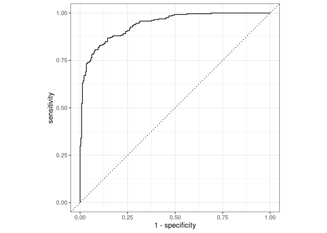
Figure 9.3: Example ROC curve
If the curve was close to the diagonal line, then the model’s predictions would be no better than random guessing. Since the curve is up in the top, left-hand corner, we see that our model performs well at different thresholds.
There are a number of other functions that use probability estimates, including gain_curve(), lift_curve(), and pr_curve().
9.4 Multiclass Classification Metrics
What about data with three or more classes? To demonstrate, let’s explore a different example data set that has four classes:
data(hpc_cv)
tibble(hpc_cv)
#> # A tibble: 3,467 × 7
#>   obs   pred     VF      F       M          L Resample
#>   <fct> <fct> <dbl>  <dbl>   <dbl>      <dbl> <chr>
#> 1 VF    VF    0.914 0.0779 0.00848 0.0000199  Fold01
#> 2 VF    VF    0.938 0.0571 0.00482 0.0000101  Fold01
#> 3 VF    VF    0.947 0.0495 0.00316 0.00000500 Fold01
#> 4 VF    VF    0.929 0.0653 0.00579 0.0000156  Fold01
#> 5 VF    VF    0.942 0.0543 0.00381 0.00000729 Fold01
#> 6 VF    VF    0.951 0.0462 0.00272 0.00000384 Fold01
#> # ℹ 3,461 more rows
As before, there are factors for the observed and predicted outcomes along with four other columns of predicted probabilities for each class. (These data also include a Resample column. These hpc_cv results are for out-of-sample predictions associated with 10-fold cross-validation. For the time being, this column will be ignored and we’ll discuss resampling in depth in Chapter 10.)
The functions for metrics that use the discrete class predictions are identical to their binary counterparts:
accuracy(hpc_cv, obs, pred)
#> # A tibble: 1 × 3
#>   .metric  .estimator .estimate
#>   <chr>    <chr>          <dbl>
#> 1 accuracy multiclass     0.709

mcc(hpc_cv, obs, pred)
#> # A tibble: 1 × 3
#>   .metric .estimator .estimate
#>   <chr>   <chr>          <dbl>
#> 1 mcc     multiclass     0.515
Note that, in these results, a “multiclass” .estimator is listed. Like “binary,” this indicates that the formula for outcomes with three or more class levels was used. The Matthews correlation coefficient was originally designed for two classes but has been extended to cases with more class levels.
There are methods for taking metrics designed to handle outcomes with only two classes and extend them for outcomes with more than two classes. For example, a metric such as sensitivity measures the true positive rate which, by definition, is specific to two classes (i.e., “event” and “nonevent”). How can this metric be used in our example data?
There are wrapper methods that can be used to apply sensitivity to our four-class outcome. These options are macro-averaging, macro-weighted averaging, and micro-averaging:
Macro-averaging computes a set of one-versus-all metrics using the standard two-class statistics. These are averaged.
Macro-weighted averaging does the same but the average is weighted by the number of samples in each class.
Micro-averaging computes the contribution for each class, aggregates them, then computes a single metric from the aggregates.
See Wu and Zhou (2017) and Opitz and Burst (2019) for more on extending classification metrics to outcomes with more than two classes.
Using sensitivity as an example, the usual two-class calculation is the ratio of the number of correctly predicted events divided by the number of true events. The manual calculations for these averaging methods are:
class_totals <-
  count(hpc_cv, obs, name = "totals") %>%
  mutate(class_wts = totals / sum(totals))
class_totals
#>   obs totals class_wts
#> 1  VF   1769   0.51024
#> 2   F   1078   0.31093
#> 3   M    412   0.11883
#> 4   L    208   0.05999

cell_counts <-
  hpc_cv %>%
  group_by(obs, pred) %>%
  count() %>%
  ungroup()

# Compute the four sensitivities using 1-vs-all
one_versus_all <-
  cell_counts %>%
  filter(obs == pred) %>%
  full_join(class_totals, by = "obs") %>%
  mutate(sens = n / totals)
one_versus_all
#> # A tibble: 4 × 6
#>   obs   pred      n totals class_wts  sens
#>   <fct> <fct> <int>  <int>     <dbl> <dbl>
#> 1 VF    VF     1620   1769    0.510  0.916
#> 2 F     F       647   1078    0.311  0.600
#> 3 M     M        79    412    0.119  0.192
#> 4 L     L       111    208    0.0600 0.534

# Three different estimates:
one_versus_all %>%
  summarize(
    macro = mean(sens),
    macro_wts = weighted.mean(sens, class_wts),
    micro = sum(n) / sum(totals)
  )
#> # A tibble: 1 × 3
#>   macro macro_wts micro
#>   <dbl>     <dbl> <dbl>
#> 1 0.560     0.709 0.709
Thankfully, there is no need to manually implement these averaging methods. Instead, yardstick functions can automatically apply these methods via the estimator argument:
sensitivity(hpc_cv, obs, pred, estimator = "macro")
#> # A tibble: 1 × 3
#>   .metric     .estimator .estimate
#>   <chr>       <chr>          <dbl>
#> 1 sensitivity macro          0.560
sensitivity(hpc_cv, obs, pred, estimator = "macro_weighted")
#> # A tibble: 1 × 3
#>   .metric     .estimator     .estimate
#>   <chr>       <chr>              <dbl>
#> 1 sensitivity macro_weighted     0.709
sensitivity(hpc_cv, obs, pred, estimator = "micro")
#> # A tibble: 1 × 3
#>   .metric     .estimator .estimate
#>   <chr>       <chr>          <dbl>
#> 1 sensitivity micro          0.709
When dealing with probability estimates, there are some metrics with multiclass analogs. For example, Hand and Till (2001) determined a multiclass technique for ROC curves. In this case, all of the class probability columns must be given to the function:
roc_auc(hpc_cv, obs, VF, F, M, L)
#> # A tibble: 1 × 3
#>   .metric .estimator .estimate
#>   <chr>   <chr>          <dbl>
#> 1 roc_auc hand_till      0.829
Macro-weighted averaging is also available as an option for applying this metric to a multiclass outcome:
roc_auc(hpc_cv, obs, VF, F, M, L, estimator = "macro_weighted")
#> # A tibble: 1 × 3
#>   .metric .estimator     .estimate
#>   <chr>   <chr>              <dbl>
#> 1 roc_auc macro_weighted     0.868
Finally, all of these performance metrics can be computed using dplyr groupings. Recall that these data have a column for the resampling groups. We haven’t yet discussed resampling in detail, but notice how we can pass a grouped data frame to the metric function to compute the metrics for each group:
hpc_cv %>%
  group_by(Resample) %>%
  accuracy(obs, pred)
#> # A tibble: 10 × 4
#>   Resample .metric  .estimator .estimate
#>   <chr>    <chr>    <chr>          <dbl>
#> 1 Fold01   accuracy multiclass     0.726
#> 2 Fold02   accuracy multiclass     0.712
#> 3 Fold03   accuracy multiclass     0.758
#> 4 Fold04   accuracy multiclass     0.712
#> 5 Fold05   accuracy multiclass     0.712
#> 6 Fold06   accuracy multiclass     0.697
#> # ℹ 4 more rows
The groupings also translate to the autoplot() methods, with results shown in Figure 9.4.
# Four 1-vs-all ROC curves for each fold
hpc_cv %>%
  group_by(Resample) %>%
  roc_curve(obs, VF, F, M, L) %>%
  autoplot()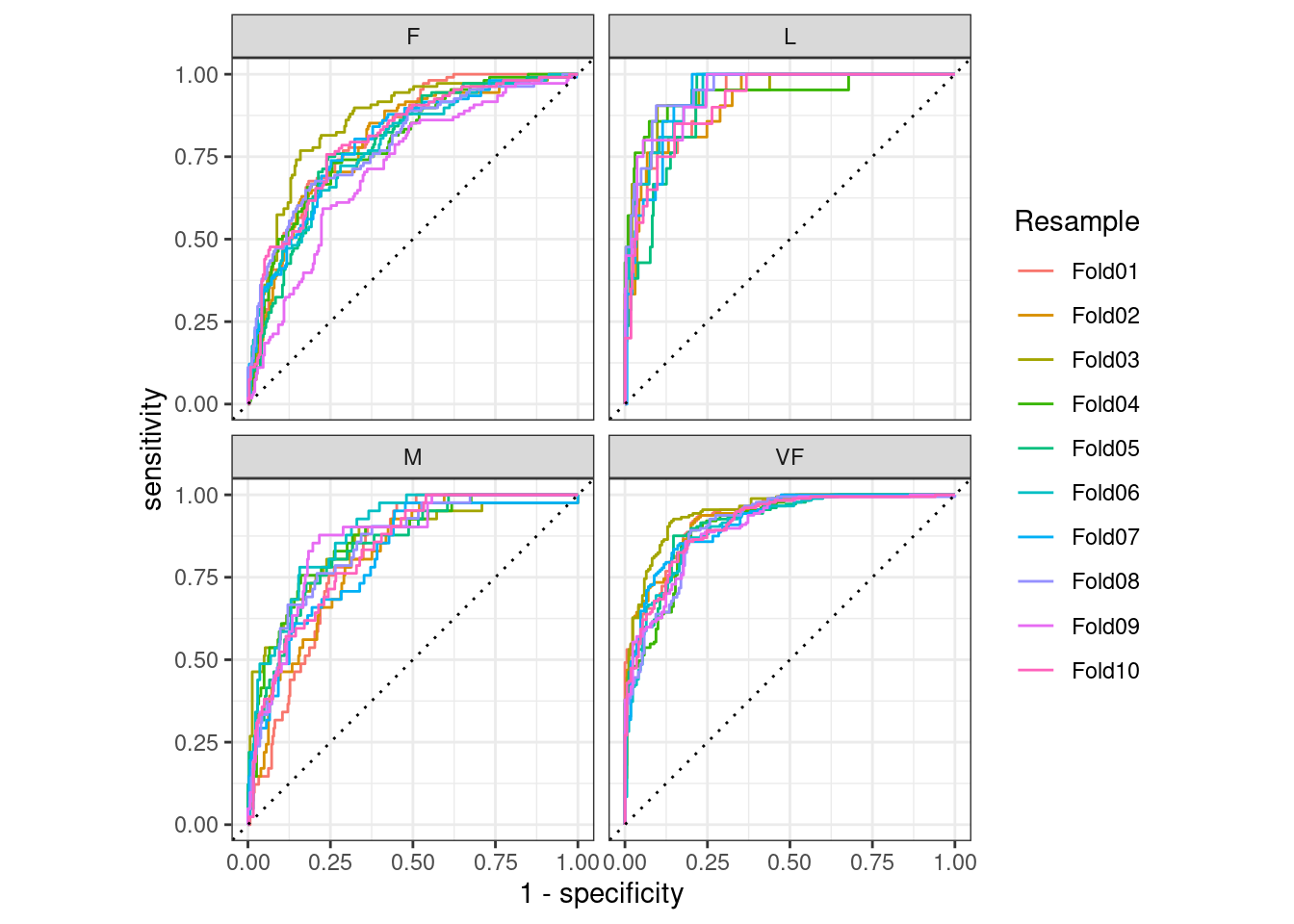
Figure 9.4: Resampled ROC curves for each of the four outcome classes
This visualization shows us that the different groups all perform about the same, but that the VF class is predicted better than the F or M classes, since the VF ROC curves are more in the top-left corner. This example uses resamples as the groups, but any grouping in your data can be used. This autoplot() method can be a quick visualization method for model effectiveness across outcome classes and/or groups.
9.5 Chapter Summary
Different metrics measure different aspects of a model fit, e.g., RMSE measures accuracy while the \(R^2\) measures correlation. Measuring model performance is important even when a given model will not be used primarily for prediction; predictive power is also important for inferential or descriptive models. Functions from the yardstick package measure the effectiveness of a model using data. The primary tidymodels interface uses tidyverse principles and data frames (as opposed to having vector arguments). Different metrics are appropriate for regression and classification metrics and, within these, there are sometimes different ways to estimate the statistics, such as for multiclass outcomes.