18 Explaining Models and Predictions
In Section 1.2, we outlined a taxonomy of models and suggested that models typically are built as one or more of descriptive, inferential, or predictive. We suggested that model performance, as measured by appropriate metrics (like RMSE for regression or area under the ROC curve for classification), can be important for all modeling applications. Similarly, model explanations, answering why a model makes the predictions it does, can be important whether the purpose of your model is largely descriptive, to test a hypothesis, or to make a prediction. Answering the question “why?” allows modeling practitioners to understand which features were important in predictions and even how model predictions would change under different values for the features. This chapter covers how to ask a model why it makes the predictions it does.
For some models, like linear regression, it is usually clear how to explain why the model makes its predictions. The structure of a linear model contains coefficients for each predictor that are typically straightforward to interpret. For other models, like random forests that can capture nonlinear behavior by design, it is less transparent how to explain the model’s predictions from only the structure of the model itself. Instead, we can apply model explainer algorithms to generate understanding of predictions.
There are two types of model explanations, global and local. Global model explanations provide an overall understanding aggregated over a whole set of observations; local model explanations provide information about a prediction for a single observation.
18.1 Software for Model Explanations
The tidymodels framework does not itself contain software for model explanations. Instead, models trained and evaluated with tidymodels can be explained with other, supplementary software in R packages such as lime, vip, and DALEX. We often choose:
- vip functions when we want to use model-based methods that take advantage of model structure (and are often faster)
- DALEX functions when we want to use model-agnostic methods that can be applied to any model
In Chapters 10 and 11, we trained and compared several models to predict the price of homes in Ames, IA, including a linear model with interactions and a random forest model, with results shown in Figure 18.1.
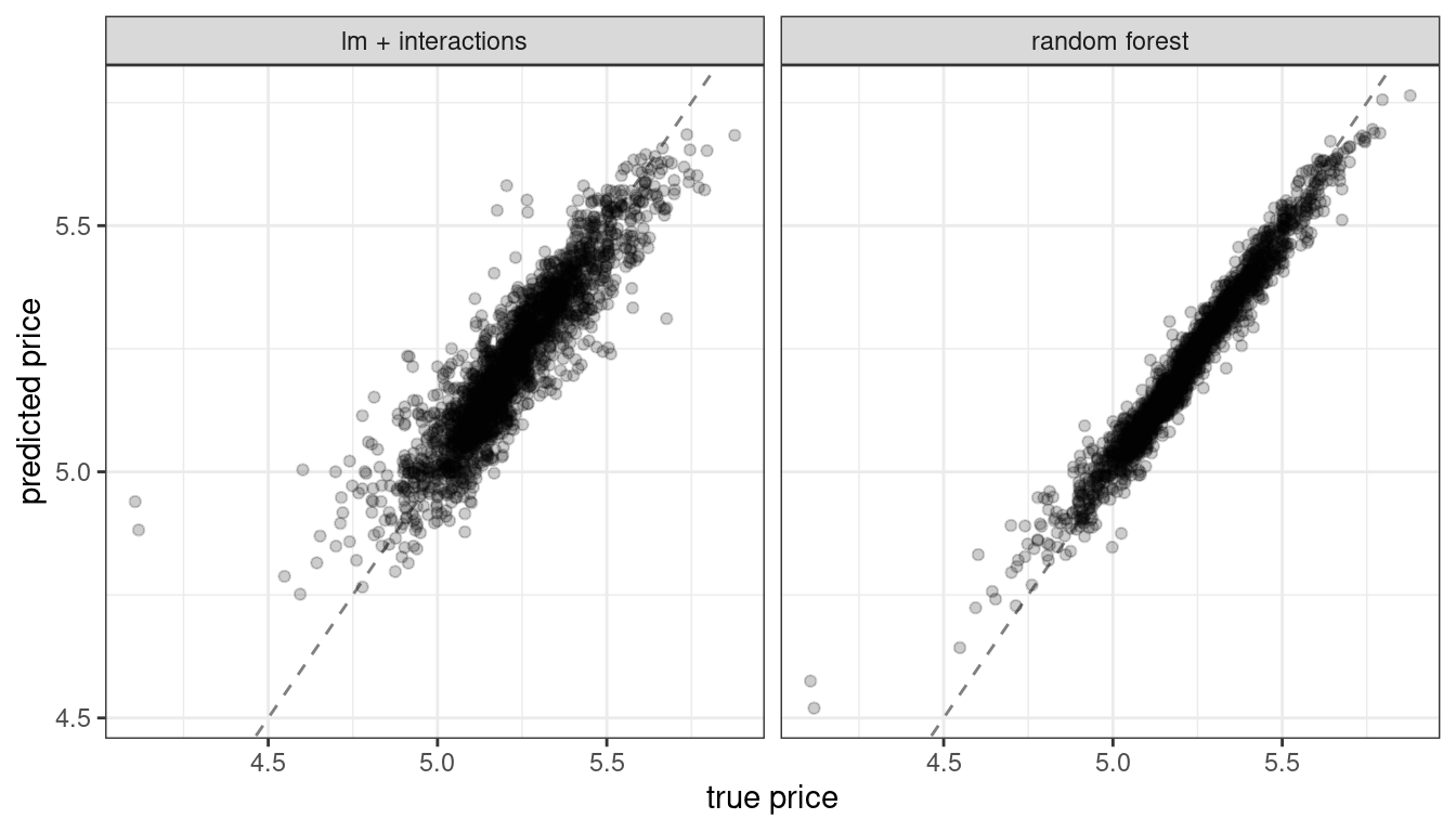
Figure 18.1: Comparing predicted prices for a linear model with interactions and a random forest model
Let’s build model-agnostic explainers for both of these models to find out why they make these predictions. We can use the DALEXtra add-on package for DALEX, which provides support for tidymodels. Biecek and Burzykowski (2021) provide a thorough exploration of how to use DALEX for model explanations; this chapter only summarizes some important approaches, specific to tidymodels. To compute any kind of model explanation, global or local, using DALEX, we first prepare the appropriate data and then create an explainer for each model:
library(DALEXtra)
vip_features <- c("Neighborhood", "Gr_Liv_Area", "Year_Built",
                  "Bldg_Type", "Latitude", "Longitude")

vip_train <-
  ames_train %>%
  select(all_of(vip_features))

explainer_lm <-
  explain_tidymodels(
    lm_fit,
    data = vip_train,
    y = ames_train$Sale_Price,
    label = "lm + interactions",
    verbose = FALSE
  )

explainer_rf <-
  explain_tidymodels(
    rf_fit,
    data = vip_train,
    y = ames_train$Sale_Price,
    label = "random forest",
    verbose = FALSE
  )
A linear model is typically straightforward to interpret and explain; you may not often find yourself using separate model explanation algorithms for a linear model. However, it can sometimes be difficult to understand or explain the predictions of even a linear model once it has splines and interaction terms!
Dealing with significant feature engineering transformations during model explainability highlights some options we have (or sometimes, ambiguity in such analyses). We can quantify global or local model explanations either in terms of:
- original, basic predictors as they existed without significant feature engineering transformations, or
- derived features, such as those created via dimensionality reduction (Chapter 16) or interactions and spline terms, as in this example.
18.2 Local Explanations
Local model explanations provide information about a prediction for a single observation. For example, let’s consider an older duplex in the North Ames neighborhood (Section 4.1):
duplex <- vip_train[120,]
duplex
#> # A tibble: 1 × 6
#>   Neighborhood Gr_Liv_Area Year_Built Bldg_Type Latitude Longitude
#>   <fct>              <dbl>      <dbl> <fct>        <dbl>     <dbl>
#> 1 North_Ames          1040       1949 Duplex        42.0     -93.6
There are multiple possible approaches to understanding why a model predicts a given price for this duplex. One is a break-down explanation, implemented with the DALEX function predict_parts(); it computes how contributions attributed to individual features change the mean model’s prediction for a particular observation, like our duplex. For the linear model, the duplex status (Bldg_Type = 3),35 size, longitude, and age all contribute the most to the price being driven down from the intercept:
lm_breakdown <- predict_parts(explainer = explainer_lm, new_observation = duplex)
lm_breakdown
#>                                           contribution
#> lm + interactions: intercept                     5.221
#> lm + interactions: Gr_Liv_Area = 1040           -0.082
#> lm + interactions: Bldg_Type = 3                -0.049
#> lm + interactions: Longitude = -93.608903       -0.043
#> lm + interactions: Year_Built = 1949            -0.039
#> lm + interactions: Latitude = 42.035841         -0.007
#> lm + interactions: Neighborhood = 1              0.001
#> lm + interactions: prediction                    5.002
Since this linear model was trained using spline terms for latitude and longitude, the contribution to price for Longitude shown here combines the effects of all of its individual spline terms. The contribution is in terms of the original Longitude feature, not the derived spline features.
The most important features are slightly different for the random forest model, with the size, age, and duplex status being most important:
rf_breakdown <- predict_parts(explainer = explainer_rf, new_observation = duplex)
rf_breakdown
#>                                       contribution
#> random forest: intercept                     5.221
#> random forest: Year_Built = 1949            -0.076
#> random forest: Gr_Liv_Area = 1040           -0.075
#> random forest: Bldg_Type = 3                -0.027
#> random forest: Longitude = -93.608903       -0.043
#> random forest: Latitude = 42.035841         -0.028
#> random forest: Neighborhood = 1             -0.003
#> random forest: prediction                    4.969
Model break-down explanations like these depend on the order of the features.
If we choose the order for the random forest model explanation to be the same as the default for the linear model (chosen via a heuristic), we can change the relative importance of the features:
predict_parts(
  explainer = explainer_rf,
  new_observation = duplex,
  order = lm_breakdown$variable_name
)
#>                                       contribution
#> random forest: intercept                     5.221
#> random forest: Gr_Liv_Area = 1040           -0.075
#> random forest: Bldg_Type = 3                -0.019
#> random forest: Longitude = -93.608903       -0.023
#> random forest: Year_Built = 1949            -0.104
#> random forest: Latitude = 42.035841         -0.028
#> random forest: Neighborhood = 1             -0.003
#> random forest: prediction                    4.969
We can use the fact that these break-down explanations change based on order to compute the most important features over all (or many) possible orderings. This is the idea behind Shapley Additive Explanations (Lundberg and Lee 2017), where the average contributions of features are computed under different combinations or “coalitions” of feature orderings. Let’s compute SHAP attributions for our duplex, using B = 20 random orderings:
set.seed(1801)
shap_duplex <-
  predict_parts(
    explainer = explainer_rf,
    new_observation = duplex,
    type = "shap",
    B = 20
  )
We could use the default plot method from DALEX by calling plot(shap_duplex), or we can access the underlying data and create a custom plot. The box plots in Figure 18.2 display the distribution of contributions across all the orderings we tried, and the bars display the average attribution for each feature:
library(forcats)
shap_duplex %>%
  group_by(variable) %>%
  mutate(mean_val = mean(contribution)) %>%
  ungroup() %>%
  mutate(variable = fct_reorder(variable, abs(mean_val))) %>%
  ggplot(aes(contribution, variable, fill = mean_val > 0)) +
  geom_col(data = ~distinct(., variable, mean_val),
           aes(mean_val, variable),
           alpha = 0.5) +
  geom_boxplot(width = 0.5) +
  theme(legend.position = "none") +
  scale_fill_viridis_d() +
  labs(y = NULL)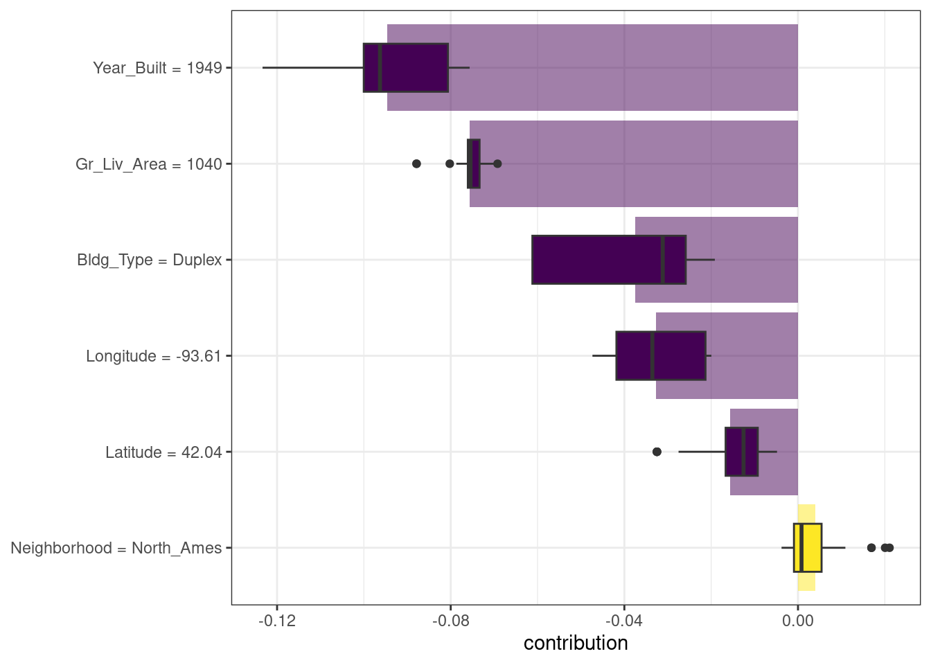
Figure 18.2: Shapley additive explanations from the random forest model for a duplex property
What about a different observation in our data set? Let’s look at a larger, newer one-family home in the Gilbert neighborhood:
big_house <- vip_train[1269,]
big_house
#> # A tibble: 1 × 6
#>   Neighborhood Gr_Liv_Area Year_Built Bldg_Type Latitude Longitude
#>   <fct>              <dbl>      <dbl> <fct>        <dbl>     <dbl>
#> 1 Gilbert             2267       2002 OneFam        42.1     -93.6
We can compute SHAP average attributions for this house in the same way:
set.seed(1802)
shap_house <-
  predict_parts(
    explainer = explainer_rf,
    new_observation = big_house,
    type = "shap",
    B = 20
  )
The results are shown in Figure 18.3; unlike the duplex, the size and age of this house contribute to its price being higher.
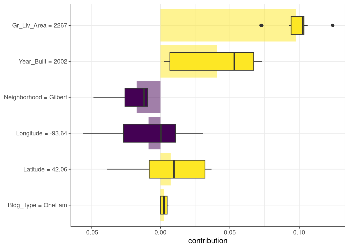
Figure 18.3: Shapley additive explanations from the random forest model for a one-family home in Gilbert
18.3 Global Explanations
Global model explanations, also called global feature importance or variable importance, help us understand which features are most important in driving the predictions of the linear and random forest models overall, aggregated over the whole training set. While the previous section addressed which variables or features are most important in predicting sale price for an individual home, global feature importance addresses the most important variables for a model in aggregate.
One way to compute variable importance is to permute the features (Breiman 2001a). We can permute or shuffle the values of a feature, predict from the model, and then measure how much worse the model fits the data compared to before shuffling.
If shuffling a column causes a large degradation in model performance, it is important; if shuffling a column’s values doesn’t make much difference to how the model performs, it must not be an important variable. This approach can be applied to any kind of model (it is model agnostic), and the results are straightforward to understand.
Using DALEX, we compute this kind of variable importance via the model_parts() function.
set.seed(1803)
vip_lm <- model_parts(explainer_lm, loss_function = loss_root_mean_square)
set.seed(1804)
vip_rf <- model_parts(explainer_rf, loss_function = loss_root_mean_square)
Again, we could use the default plot method from DALEX by calling plot(vip_lm, vip_rf) but the underlying data is available for exploration, analysis, and plotting. Let’s create a function for plotting:
ggplot_imp <- function(...) {
  obj <- list(...)
  metric_name <- attr(obj[[1]], "loss_name")
  metric_lab <- paste(metric_name,
                      "after permutations\n(higher indicates more important)")

  full_vip <- bind_rows(obj) %>%
    filter(variable != "_baseline_")

  perm_vals <- full_vip %>%
    filter(variable == "_full_model_") %>%
    group_by(label) %>%
    summarise(dropout_loss = mean(dropout_loss))

  p <- full_vip %>%
    filter(variable != "_full_model_") %>%
    mutate(variable = fct_reorder(variable, dropout_loss)) %>%
    ggplot(aes(dropout_loss, variable))
  if(length(obj) > 1) {
    p <- p +
      facet_wrap(vars(label)) +
      geom_vline(data = perm_vals, aes(xintercept = dropout_loss, color = label),
                 linewidth = 1.4, lty = 2, alpha = 0.7) +
      geom_boxplot(aes(color = label, fill = label), alpha = 0.2)
  } else {
    p <- p +
      geom_vline(data = perm_vals, aes(xintercept = dropout_loss),
                 linewidth = 1.4, lty = 2, alpha = 0.7) +
      geom_boxplot(fill = "#91CBD765", alpha = 0.4)

  }
  p +
    theme(legend.position = "none") +
    labs(x = metric_lab,
         y = NULL,  fill = NULL,  color = NULL)
}
Using ggplot_imp(vip_lm, vip_rf) produces Figure 18.4.
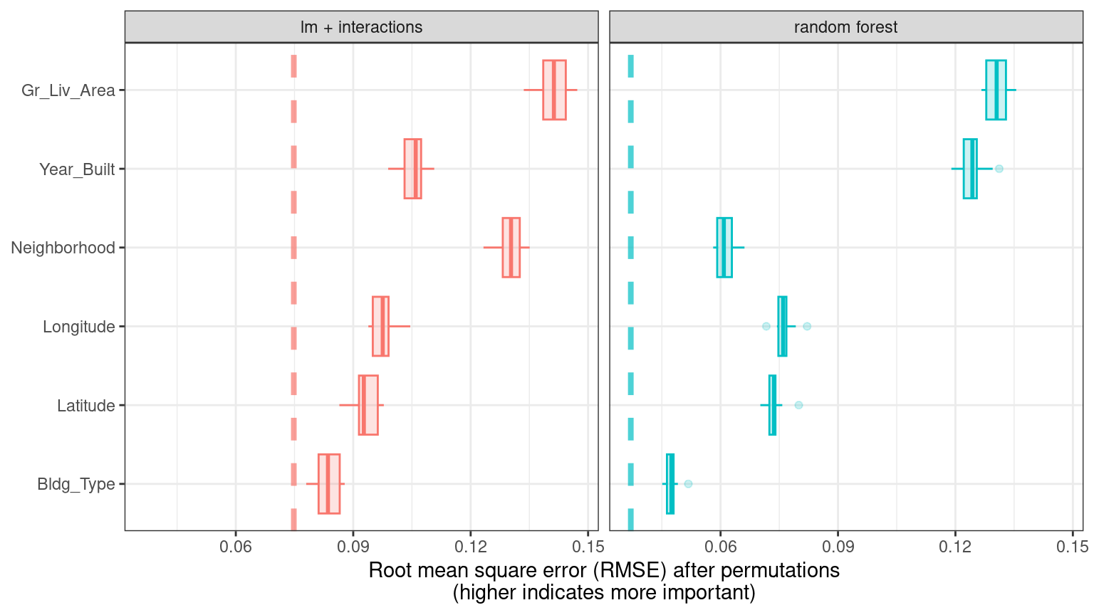
Figure 18.4: Global explainer for the random forest and linear regression models
The dashed line in each panel of Figure 18.4 shows the RMSE for the full model, either the linear model or the random forest model. Features farther to the right are more important, because permuting them results in higher RMSE. There is quite a lot of interesting information to learn from this plot; for example, neighborhood is quite important in the linear model with interactions/splines but the second least important feature for the random forest model.
18.4 Building Global Explanations from Local Explanations
So far in this chapter, we have focused on local model explanations for a single observation (via Shapley additive explanations) and global model explanations for a data set as a whole (via permuting features). It is also possible to build global model explanations by aggregating local model explanations, as with partial dependence profiles.
Partial dependence profiles show how the expected value of a model prediction, like the predicted price of a home in Ames, changes as a function of a feature, like the age or gross living area.
One way to build such a profile is by aggregating or averaging profiles for individual observations. A profile showing how an individual observation’s prediction changes as a function of a given feature is called an ICE (individual conditional expectation) profile or a CP (ceteris paribus) profile. We can compute such individual profiles (for 500 of the observations in our training set) and then aggregate them using the DALEX function model_profile():
set.seed(1805)
pdp_age <- model_profile(explainer_rf, N = 500, variables = "Year_Built")
Let’s create another function for plotting the underlying data in this object:
ggplot_pdp <- function(obj, x) {

  p <-
    as_tibble(obj$agr_profiles) %>%
    mutate(`_label_` = stringr::str_remove(`_label_`, "^[^_]*_")) %>%
    ggplot(aes(`_x_`, `_yhat_`)) +
    geom_line(data = as_tibble(obj$cp_profiles),
              aes(x = {{ x }}, group = `_ids_`),
              linewidth = 0.5, alpha = 0.05, color = "gray50")

  num_colors <- n_distinct(obj$agr_profiles$`_label_`)

  if (num_colors > 1) {
    p <- p + geom_line(aes(color = `_label_`), linewidth = 1.2, alpha = 0.8)
  } else {
    p <- p + geom_line(color = "midnightblue", linewidth = 1.2, alpha = 0.8)
  }

  p
}
Using this function generates Figure 18.5, where we can see the nonlinear behavior of the random forest model.
ggplot_pdp(pdp_age, Year_Built)  +
  labs(x = "Year built",
       y = "Sale Price (log)",
       color = NULL)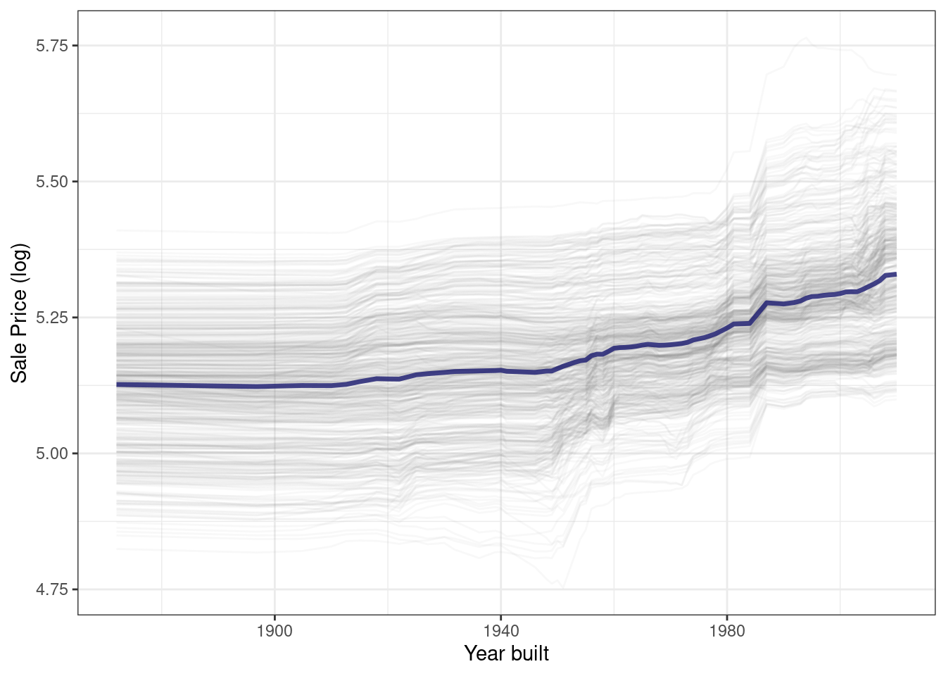
Figure 18.5: Partial dependence profiles for the random forest model focusing on the year built predictor
Sale price for houses built in different years is mostly flat, with a modest rise after about 1960. Partial dependence profiles can be computed for any other feature in the model, and also for groups in the data, such as Bldg_Type. Let’s use 1,000 observations for these profiles.
set.seed(1806)
pdp_liv <- model_profile(explainer_rf, N = 1000,
                         variables = "Gr_Liv_Area",
                         groups = "Bldg_Type")

ggplot_pdp(pdp_liv, Gr_Liv_Area) +
  scale_x_log10() +
  scale_color_brewer(palette = "Dark2") +
  labs(x = "Gross living area",
       y = "Sale Price (log)",
       color = NULL)
This code produces Figure 18.6, where we see that sale price increases the most between about 1,000 and 3,000 square feet of living area, and that different home types (like single family homes or different types of townhouses) mostly exhibit similar increasing trends in price with more living space.
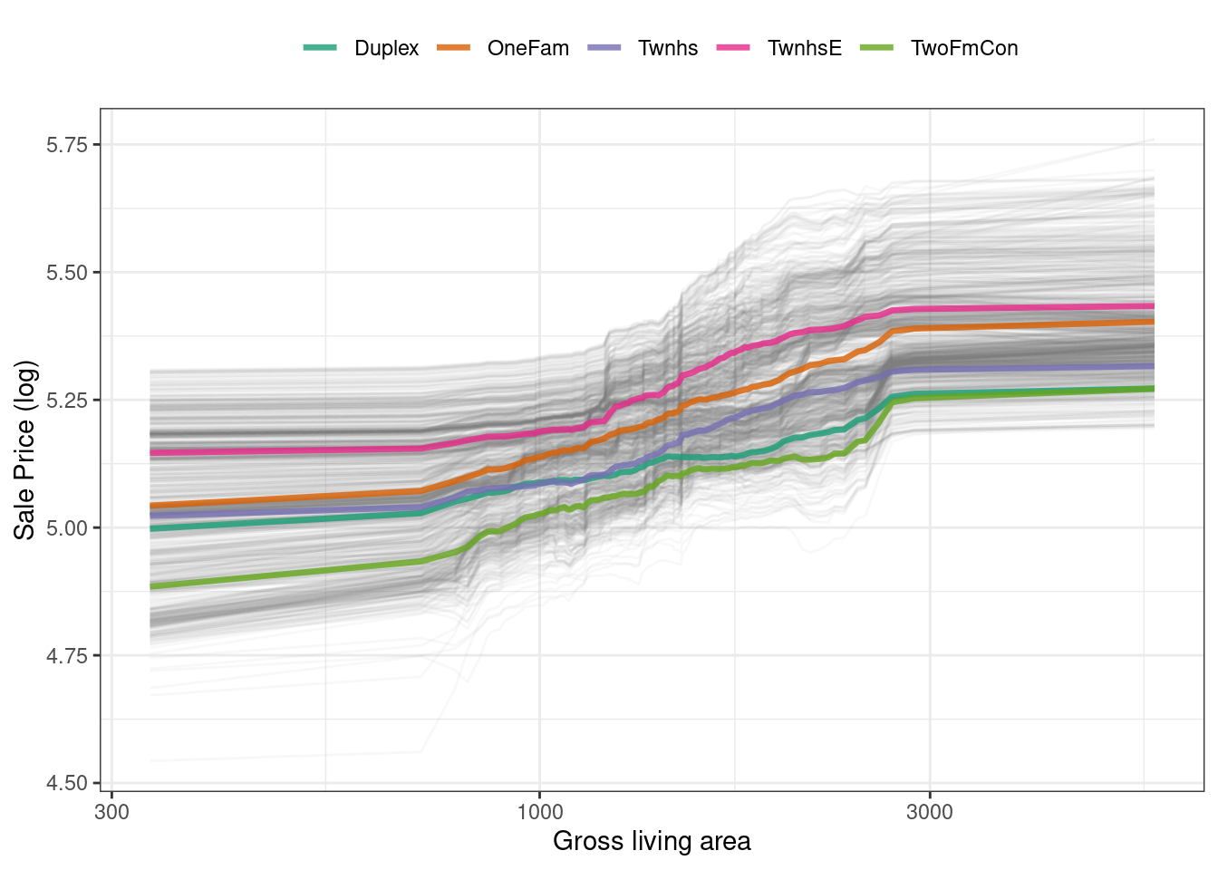
Figure 18.6: Partial dependence profiles for the random forest model focusing on building types and gross living area
We have the option of using plot(pdp_liv) for default DALEX plots, but since we are making plots with the underlying data here, we can even facet by one of the features to visualize if the predictions change differently and highlighting the imbalance in these subgroups (as shown in Figure 18.7).
as_tibble(pdp_liv$agr_profiles) %>%
  mutate(Bldg_Type = stringr::str_remove(`_label_`, "random forest_")) %>%
  ggplot(aes(`_x_`, `_yhat_`, color = Bldg_Type)) +
  geom_line(data = as_tibble(pdp_liv$cp_profiles),
            aes(x = Gr_Liv_Area, group = `_ids_`),
            linewidth = 0.5, alpha = 0.1, color = "gray50") +
  geom_line(linewidth = 1.2, alpha = 0.8, show.legend = FALSE) +
  scale_x_log10() +
  facet_wrap(~Bldg_Type) +
  scale_color_brewer(palette = "Dark2") +
  labs(x = "Gross living area",
       y = "Sale Price (log)",
       color = NULL)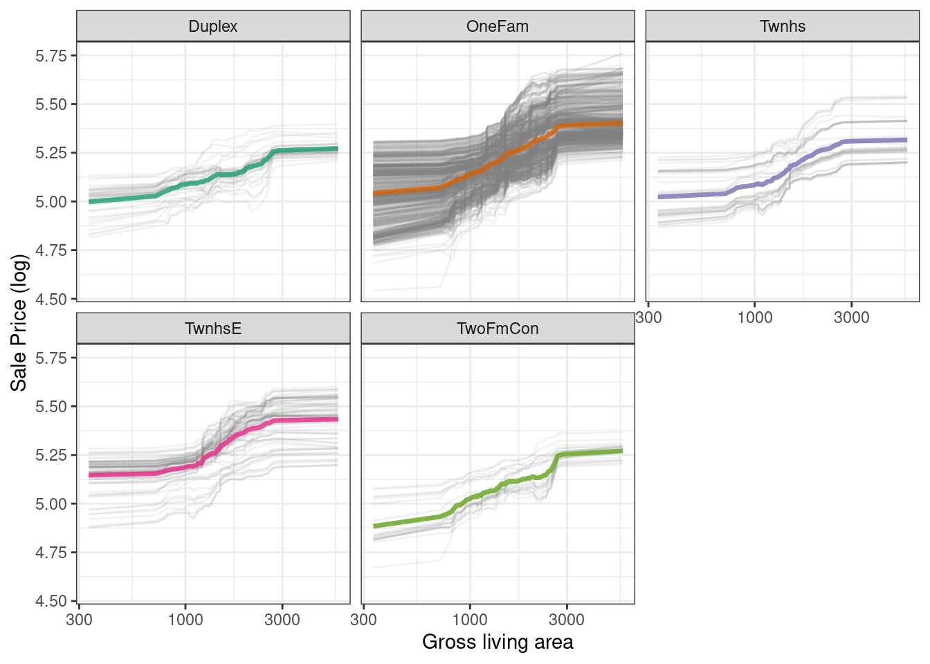
Figure 18.7: Partial dependence profiles for the random forest model focusing on building types and gross living area using facets
There is no one correct approach for building model explanations, and the options outlined in this chapter are not exhaustive. We have highlighted good options for explanations at both the individual and global level, as well as how to bridge from one to the other, and we point you to Biecek and Burzykowski (2021) and Molnar (2020) for further reading.
18.5 Back to Beans!
In Chapter 16, we discussed how to use dimensionality reduction as a feature engineering or preprocessing step when modeling high-dimensional data. For our example data set of dry bean morphology measures predicting bean type, we saw great results from partial least squares (PLS) dimensionality reduction combined with a regularized discriminant analysis model. Which of those morphological characteristics were most important in the bean type predictions? We can use the same approach outlined throughout this chapter to create a model-agnostic explainer and compute, say, global model explanations via model_parts():
set.seed(1807)
vip_beans <-
  explain_tidymodels(
    rda_wflow_fit,
    data = bean_train %>% select(-class),
    y = bean_train$class,
    label = "RDA",
    verbose = FALSE
  ) %>%
  model_parts()
Using our previously defined importance plotting function, ggplot_imp(vip_beans) produces Figure 18.8.
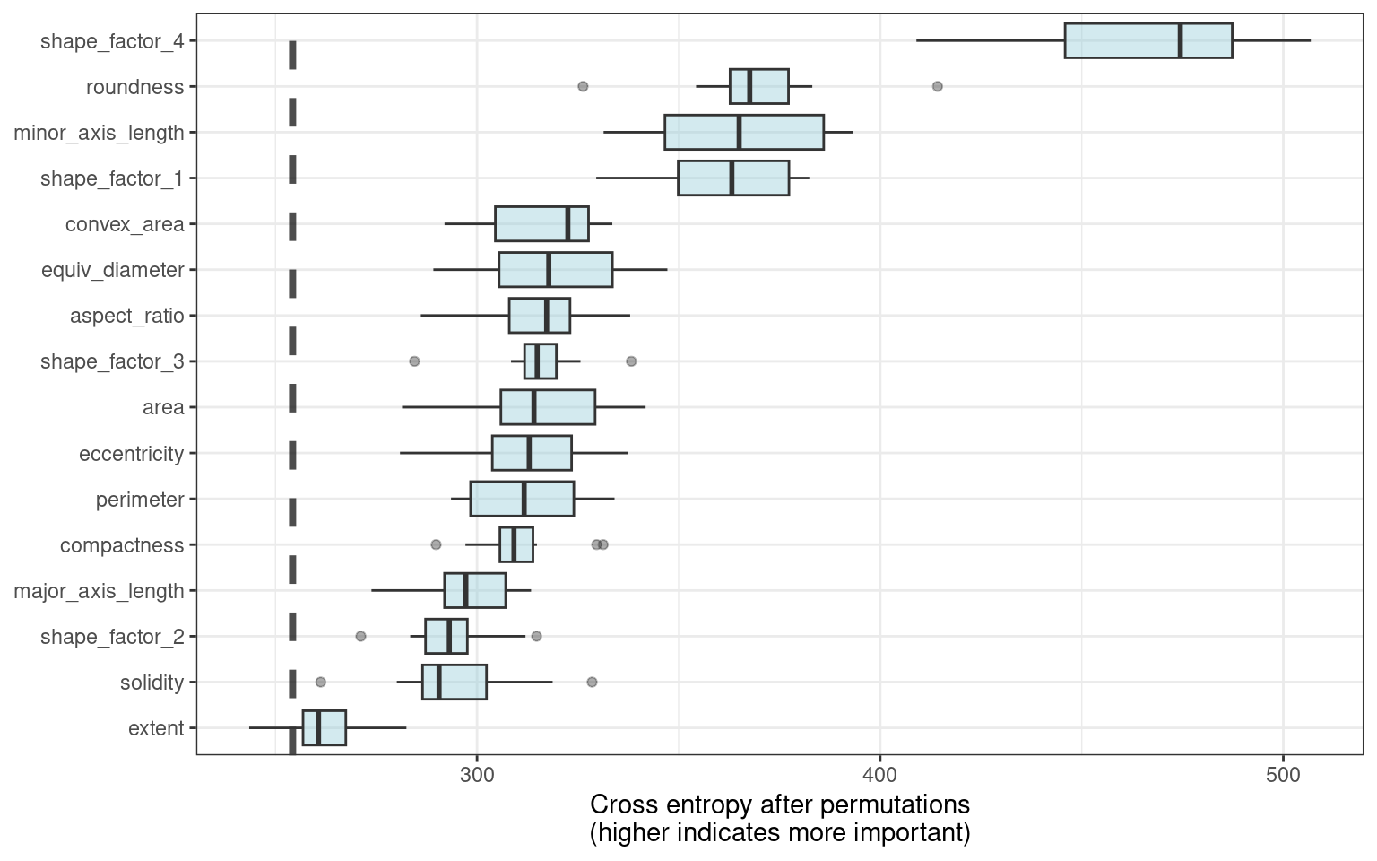
Figure 18.8: Global explainer for the regularized discriminant analysis model on the beans data
The measures of global feature importance that we see in Figure 18.8 incorporate the effects of all of the PLS components, but in terms of the original variables.
Figure 18.8 shows us that shape factors are among the most important features for predicting bean type, especially shape factor 4, a measure of solidity that takes into account the area \(A\), major axis \(L\), and minor axis \(l\):
\[\text{SF4} = \frac{A}{\pi(L/2)(l/2)}\]
We can see from Figure 18.8 that shape factor 1 (the ratio of the major axis to the area), the minor axis length, and roundness are the next most important bean characteristics for predicting bean variety.
18.6 Chapter Summary
For some types of models, the answer to why a model made a certain prediction is straightforward, but for other types of models, we must use separate explainer algorithms to understand what features are relatively most important for predictions. You can generate two main kinds of model explanations from a trained model. Global explanations provide information aggregated over an entire data set, while local explanations provide understanding about a model’s predictions for a single observation.
Packages such as DALEX and its supporting package DALEXtra, vip, and lime can be integrated into a tidymodels analysis to provide these model explainers. Model explanations are just one piece of understanding whether your model is appropriate and effective, along with estimates of model performance; Chapter 19 further explores the quality and trustworthiness of predictions.
REFERENCES
Notice that this package for model explanations focuses on the level of categorical predictors in this type of output, like
Bldg_Type = 3for duplex andNeighborhood = 1for North Ames.↩︎